Many websites try too hard to sell.
Pop-ups appear before you’ve read a sentence. Buttons compete for attention. Headlines promise urgency and demand action immediately. The experience feels less like a helpful introduction and more like a sales pitch.
But most people don’t visit a website ready to act the moment they arrive. They arrive with questions.
Good websites don’t pressure visitors into decisions. They guide them toward confidence.
What Visitors Are Actually Thinking
- Am I in the right place?
- Can I trust this organization?
- Do they help people like me?
- What happens if I take the next step?
Confidence Comes Before Action
Many organizations design their websites around what they want visitors to do.
- Donate.
- Book a call.
- Apply.
- Register.
Those are important goals. But they come after a visitor feels confident.
Think about how decisions happen in real life. When you walk into a store, you look around first. When you meet someone new, you talk before making commitments. When you support a cause, you want to understand the mission and impact before giving.
Websites should work the same way.
Before asking someone to take action, a site should help them feel comfortable, informed, and confident.
But What About Early Calls to Action?
If you look closely at many websites, you’ll notice something interesting: a call to action is often visible right away.
You might see a button like:
- Donate
- Contact Us
- Book a Call
- Apply Now
- Get Started
That’s not necessarily a problem.
Some visitors already know what they want and arrive ready to take action. Making that next step visible and easy helps those people move forward quickly.
The real difference is how the website behaves after that first moment.
Strong websites don’t interrupt visitors with pressure. Instead, they guide people through understanding what the organization does, why it matters, and whether it’s the right fit before encouraging them to act.
In other words, the option to act may be visible early but the confidence to act is built gradually.
The Role of a Good Website
A helpful website acts like a good guide.
It doesn’t overwhelm visitors with choices. It doesn’t rush them toward a decision. Instead, it walks them through a clear and thoughtful path.
That path often looks like this:
Alignment
Visitors quickly understand who you are and what you do.
Trust
They see signals that your organization is credible and consistent.
Proof
They learn how your work actually helps people.
Belonging
They begin to feel connected to your mission or approach.
Action
Once confidence is built, the next step becomes clear and easy.
When a website follows this natural progression, visitors don’t feel pushed. They feel supported.
Why This Matters for Small Organizations
Large brands can rely on recognition and advertising to drive action. Smaller organizations don’t have that luxury.
Nonprofits, schools, and small businesses succeed differently.
They succeed through trust.
Their websites often serve as the first introduction someone has to the organization. If that experience feels confusing, rushed, or overwhelming, potential supporters quietly move on.
But when a website feels calm and clear, something important happens. Visitors stay longer. They explore. They learn.
And eventually, they act.
Designing for Clarity Instead of Pressure
A guiding website tends to share a few characteristics:
- Clear messaging that explains who the organization serves
- Simple navigation that reduces confusion
- Thoughtful storytelling that builds trust
- Proof points such as testimonials, outcomes, or impact
- One or two clear next steps rather than many competing ones
None of these tactics are flashy. But together they create an experience that helps people move from curiosity to confidence.
A Different Way to Think About Websites
It’s easy to think of a website as a digital brochure or a place to collect information.
But the most effective websites do something more meaningful.
They help people make decisions.
When a website is designed thoughtfully, each section builds on the one before it. Visitors learn a little more, trust a little more, and feel a little more comfortable with each step.
By the time they reach the point where action is possible, the decision already feels natural.
Not forced.
Not rushed.
Just clear.
A Real Example: How a Website Guides Visitors
To see how this works in practice, it helps to look at a real homepage.
Take Mailchimp, a platform designed to help businesses manage email marketing and automation. Their website is built to encourage signups, but the structure of the page still follows a clear progression that builds understanding and confidence before pushing visitors to act.
Let’s look at how the page works, starting with the hero section.
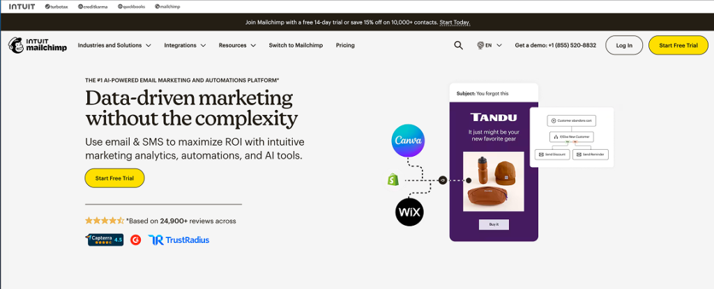
#1 Alignment — The Hero Section
The hero section of a homepage has one primary job: help visitors understand quickly where they are and why it matters.
In Mailchimp’s hero, the headline reads:
“Data-driven marketing without the complexity.”
This short message does several important things immediately:
- It explains the core benefit
- It suggests a common pain point (complex marketing tools)
- It promises a simpler solution
The supporting line reinforces this value:
Use email & SMS to maximize ROI with intuitive marketing analytics, automations, and AI tools.
Within seconds, visitors understand what the platform helps them accomplish.
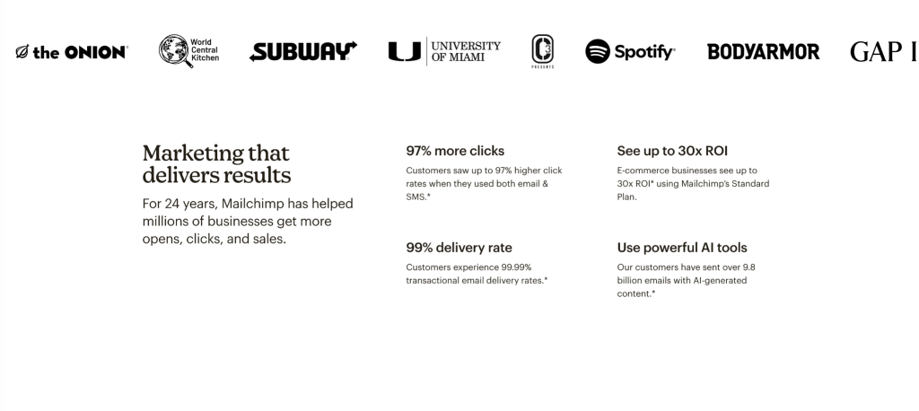
#2 Trust — Credibility and Evidence
After the hero establishes what Mailchimp does, the next section focuses on building credibility.
At the top of this section, visitors see a row of recognizable brands that use the platform, including organizations like Spotify, Subway, and GAP.
This kind of visual signal is powerful. When visitors recognize brands they trust, it immediately answers an important question:
“Do real organizations rely on this?”
This type of brand association helps establish legitimacy quickly without requiring long explanations.
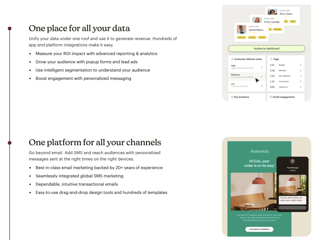
#3 Proof and Fit — Showing How the Solution Works
After establishing credibility and results, the next section of the Mailchimp homepage shifts from why the platform works to how it works in practice.
Visitors are introduced to two key ideas:
“One place for all your data”
and
“One platform for all your channels.”
At this stage, the site begins helping visitors visualize how the platform fits into their daily work.
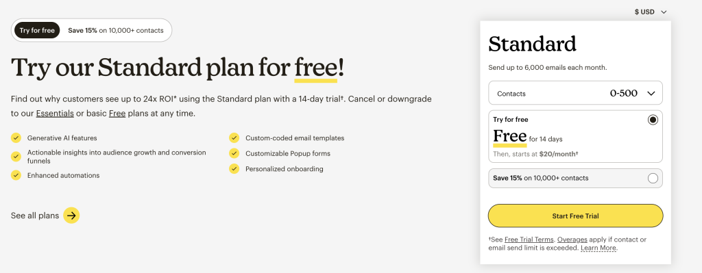
#4 Action — A Clear Next Step
After guiding visitors through the platform’s value, credibility, and capabilities, the Mailchimp page arrives at its final stage: inviting the visitor to act.
The headline is simple and direct:
“Try our Standard plan for free!”
At this point in the page, visitors already understand what Mailchimp does, how it works, and why businesses use it. The call to action no longer feels like a push, it feels like the natural next step.
Looking Ahead
Different types of organizations guide visitors in different ways.
A nonprofit may focus on building mission alignment and trust before asking for a donation. A small business may emphasize credibility and fit before inviting a conversation. A realtor may build personal connection and local expertise before encouraging a consultation.
In the coming posts, we’ll look at how these different journeys appear on real websites.
Because while every organization is unique, the underlying principle remains the same.
The best websites don’t push people toward decisions.
They guide them there.
References
Screenshots from MailChimp.com
Cover image from Alexander Milo.
